long:~$ cat plot-dump.md
Plot Dump
A portfolio of data visualisations I have created over the course of my studies and extracurricular activities, made with R.
## Paid work
## CorrelAid projects
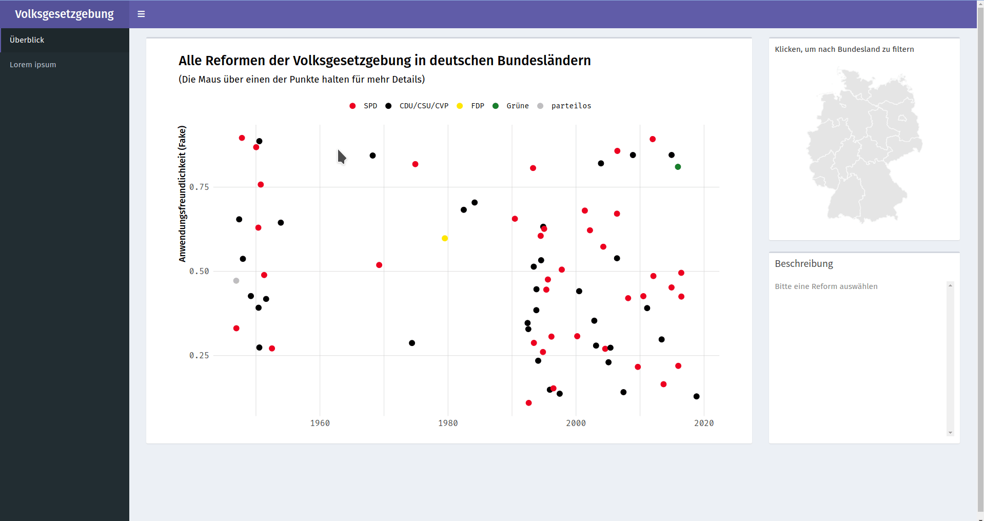
Reforms of popular vote laws in German states
Proof of concept, in cooperation with Mehr Demokratie e.V.
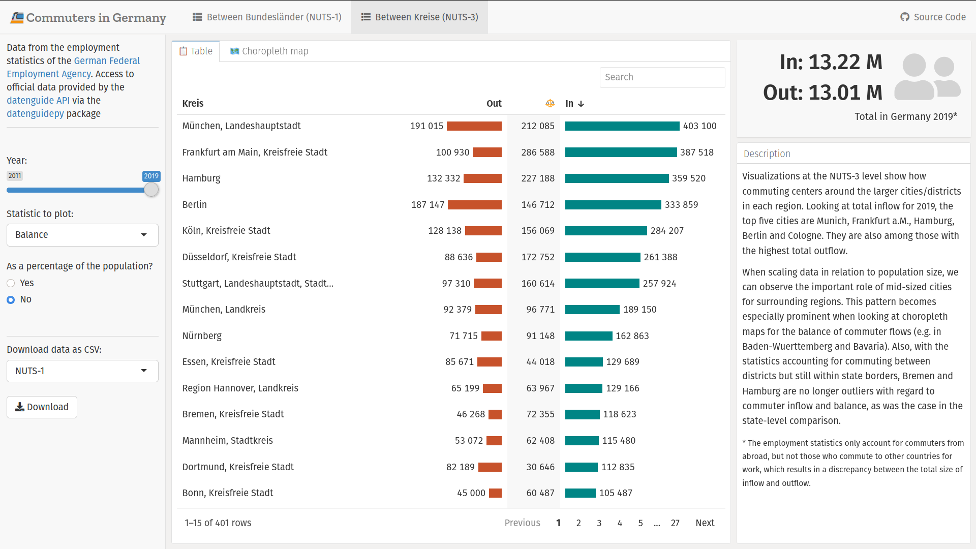
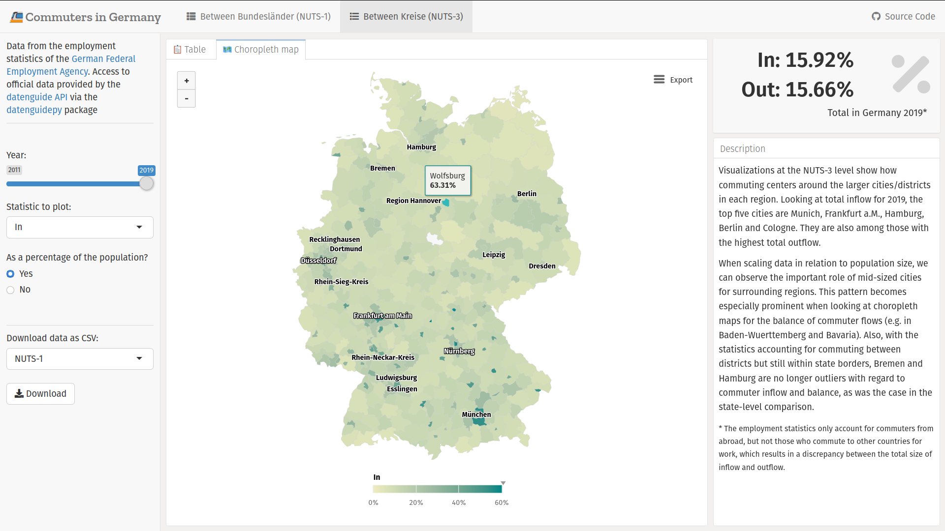
An interactive dashboard about commuting in Germany
CorrelAidX Challenge 2020.
theme_correlaid() & scale_colour_correlaid() for ggplot2
Functions in the correltools package.
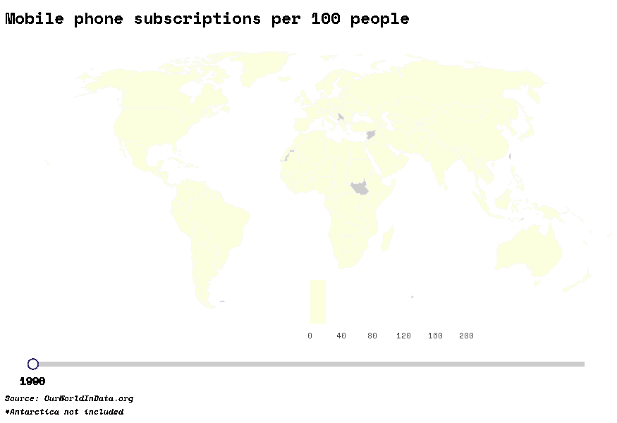
## #30DayMapChallenge
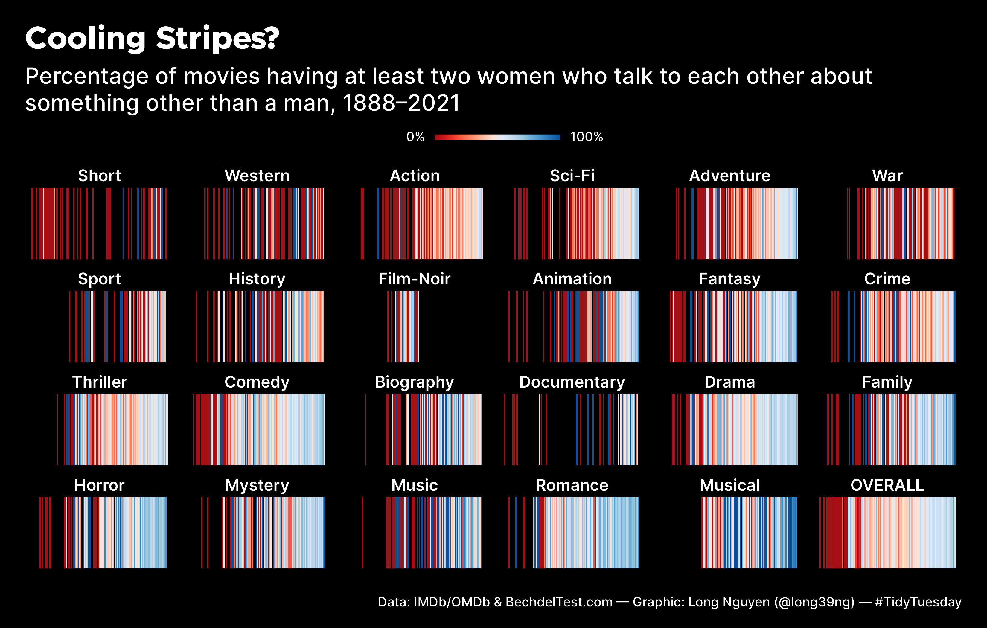
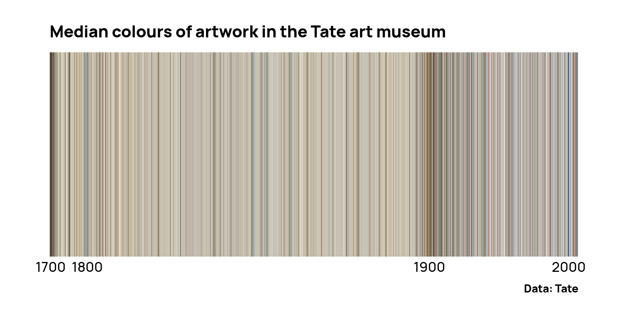
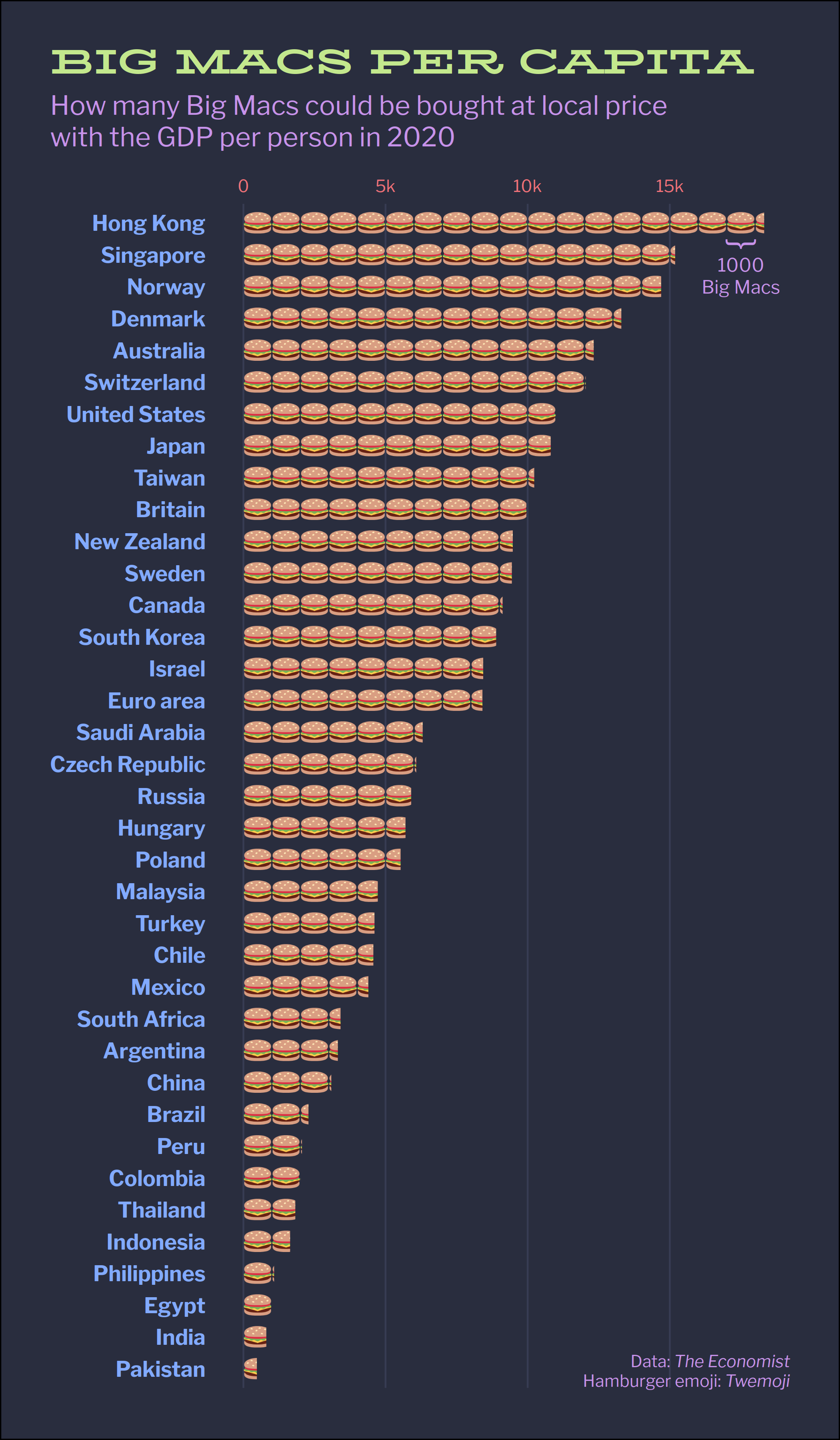
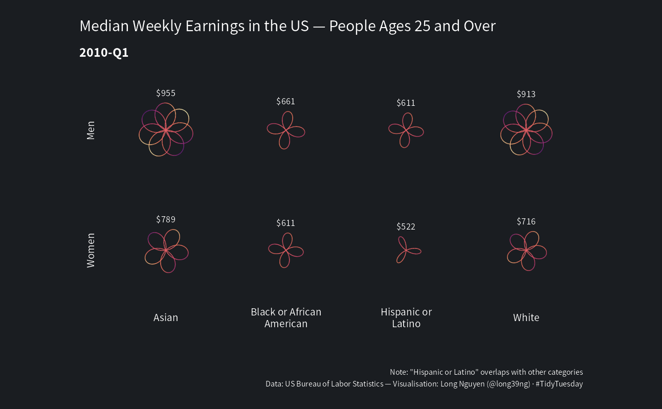
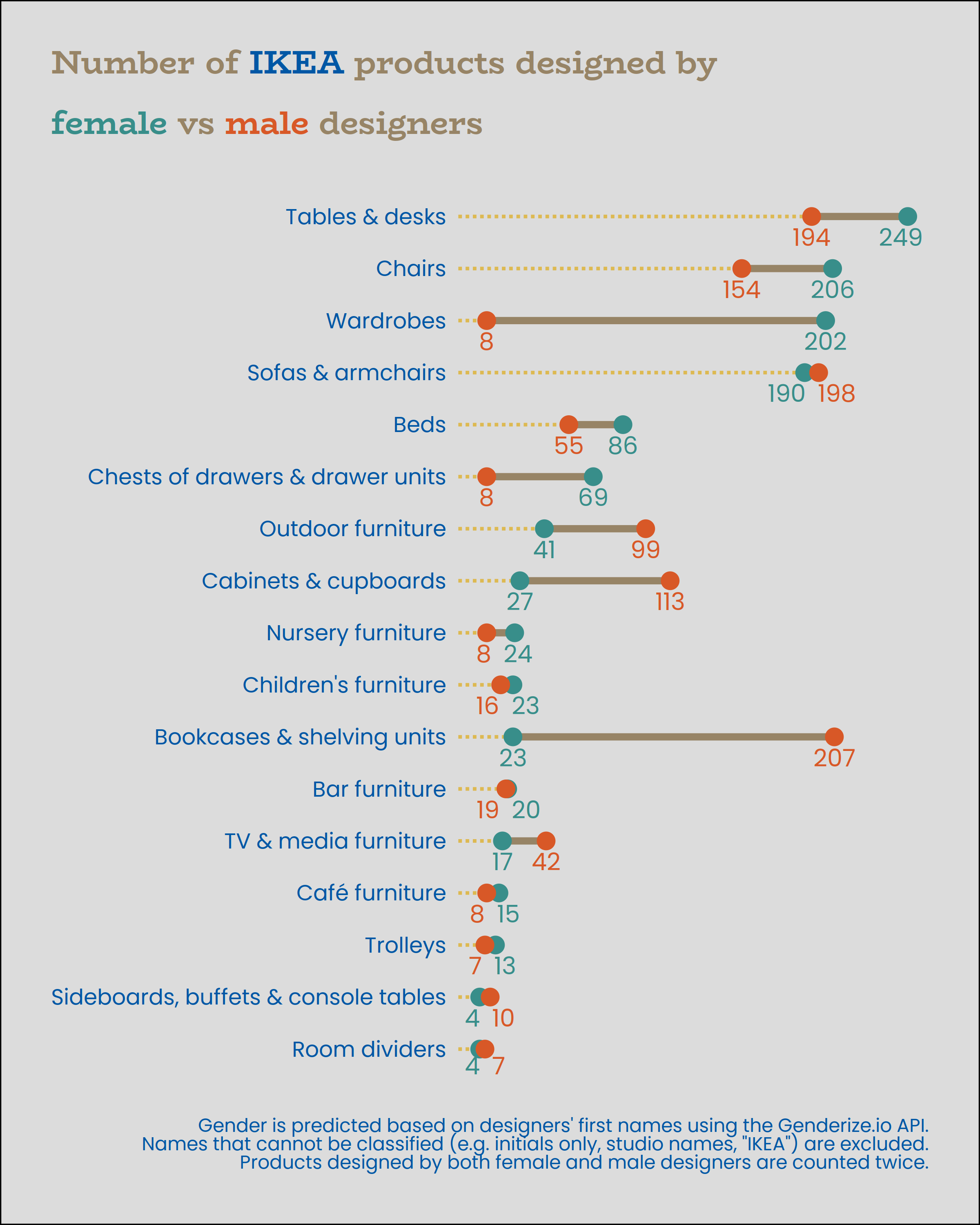
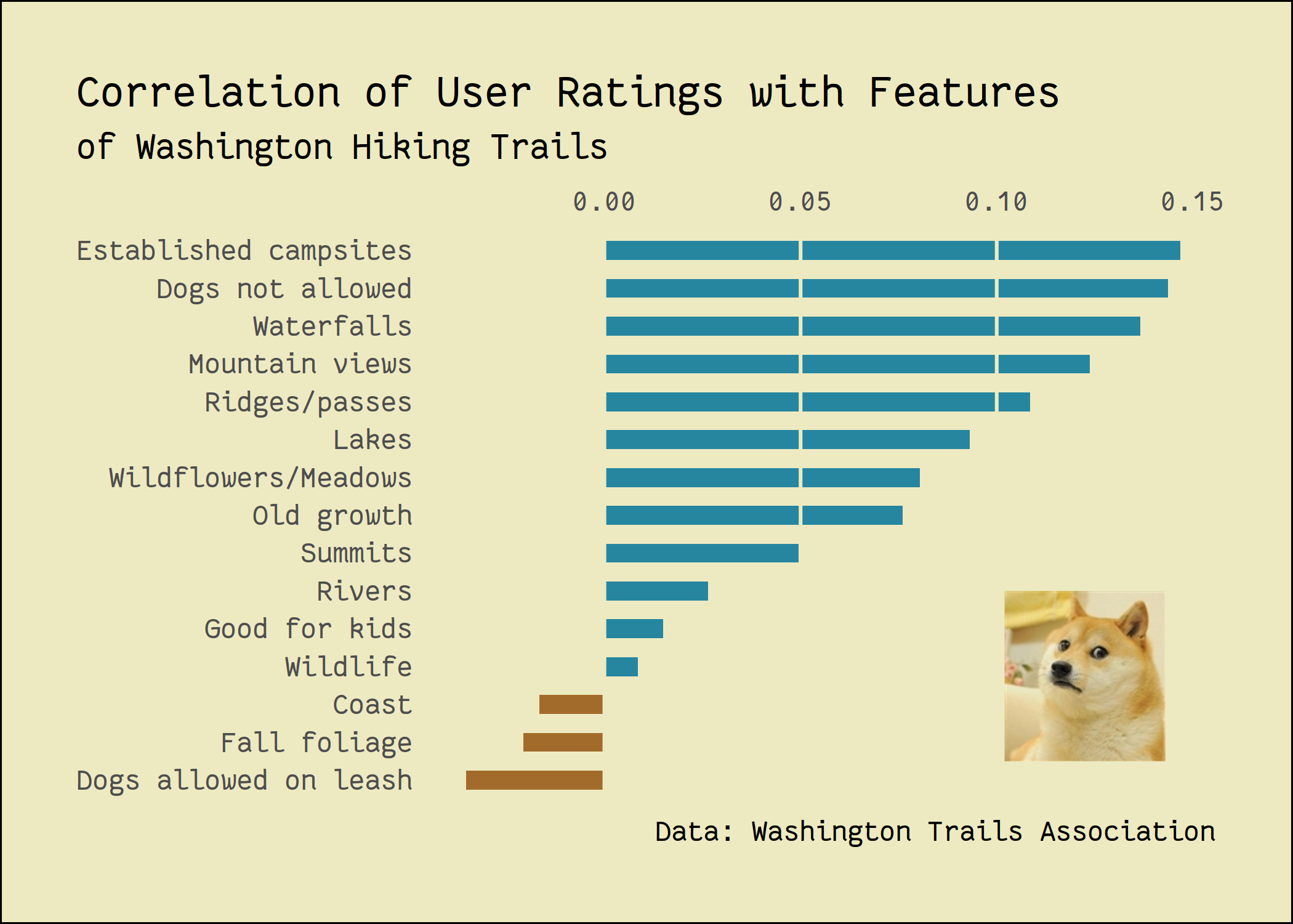
## #TidyTuesday
Click a figure to view its source code.